Redesigning FreeAgent

Posted on 30 June 2011 by Comments (29)

In the next few months we'll be launching a redesign of the FreeAgent interface. This isn’t just a lick of paint; we're reworking the user interface to make it faster, more flexible and intuitive! But don't panic, we won't be pulling the rug out from under your feet.

Why redesign?

We've felt a need to address certain restrictions with the current layout for some time now. FreeAgent has developed a lot since it launched 4 years ago, but the core layout has stayed more or less the same.

Each new piece of functionality has been built in when required, and although we think really carefully (and usually debate endlessly) about the right approach to take, there are inevitably elements within FreeAgent that weren't planned for when we designed the interface back in 2007.

Additionally, we’ve got loads of ideas for improving the display of content and data, that just aren’t possible with the current user interface.

So, our 3 key objectives for the new interface are:

  • Efficiency - the new design will make better use of screen real estate, with an even simpler, more intuitive and attractive interface.
  • Flexibility - the new design will allow us to introduce different layouts across the app, so we can provide richer data views, and work better across a range of screen sizes and devices.
  • Performance - the new design will improve performance which should result in a faster app for everyone.

Like with any redesign project, people are bound to have opinions, both positive and negative. We're keen to hear both, which is why we’re talking about this now.

What’s going to change?

In many ways if it ain't broke, don’t fix it, so the way the app works will remain largely unchanged.

What will be different is how it looks, and the new layouts will give us the opportunity to provide better, faster views of your data.

New Overview

A big change will be the new Overview page. We'll be speeding it up and adding some amazing new functionality, which we’re all really excited about. Here’s a sneak peek:

FreeAgent Overview

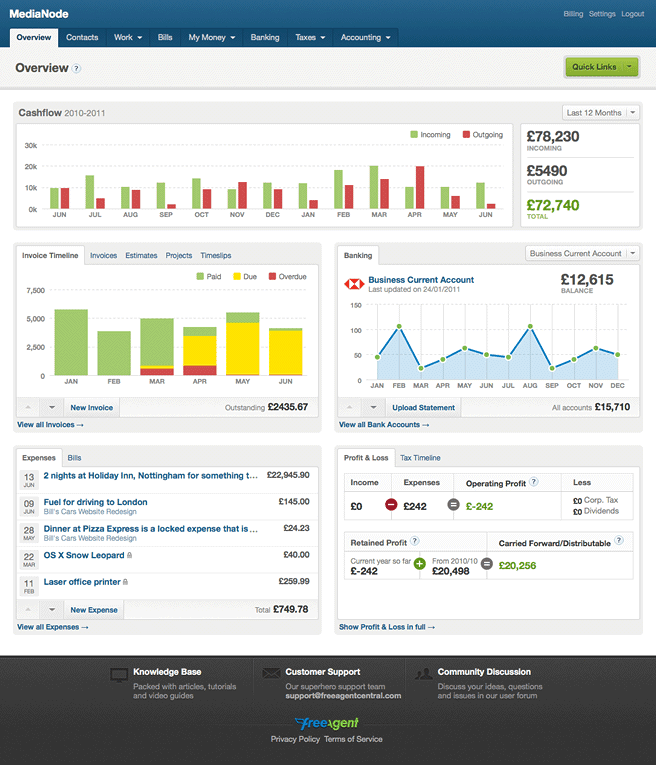
The new panel layout on the Overview screen and potential ideas for cashflow display.

It's very much a work in progress at present, and we’ll talk more about this in an upcoming post, because it does deserve digging in to.

Streamlined header and navigation

FreeAgent Header

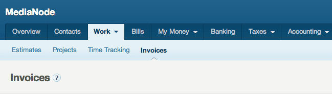
The streamlined application header, main navigation and secondary navigation.

We've made the decision to remove the company logo from the header. It was a nice branding touch for some, but in practice these don’t work well for many logos, the overall layout, and ultimately add nothing to the task in hand - doing your accounts! So, we’ve decided to axe them. Some people will no doubt feel strongly about this, but we believe it’s the right move, and we'll stick by that.

Your logos will still be used on invoices and estimates of course!

Overall, the new header is more streamlined, meaning you get to the content quicker and with less distractions.

The omnipresent left hand column is gone, and the secondary navigation has been moved below the main tabs. This immediately frees up space, allowing for cleaner layouts, and the design will work better across a variety of screen sizes and devices.

New opportunities

With the often redundant left column gone we have the option of adding a supplementary column of information to enhance existing page views.

FreeAgent invoice

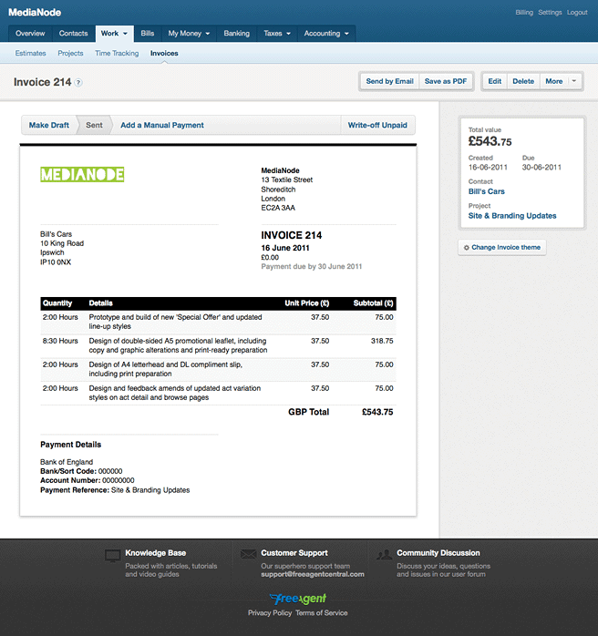
The new Invoice page with right hand column, which includes useful "meta" information.

This is one area we’ll definitely utilise more in the future, but here’s an example of how it might be useful on the new invoice page, where you’ll now be able to see useful information about the invoice and click through to the associated Contact or Project.

Get involved

That's just a small teaser of what's coming with the new interface, but ultimately it’s your app as much as it is ours, so we want to show you the new design as it comes together and get your input.

Over the coming weeks we’ll be conducting beta testing with a small group of existing users. Initially we’re restricting this to a manageable amount, but if you really want to get involved, and can commit to spending some time, then get in touch by emailing me at beta@freeagent.com.

We're also going to be running some hands on user testing sessions here in Edinburgh. If you're fairly local and would like to come to the FreeAgent offices to take part in a short user testing session, then email beta@freeagent.com. You'll get tea and biscuits, as well as a small fee for your time.

Over to you...

Russell Poulter, Thu June 30, 2011
Looks very nice!

That centre aligned footer looks a bit out of place with the rest of the design though.
Paul Allington, Thu June 30, 2011
One of the main things that bugs me about the FA UI (and actually it's not that big) is that it doesn't always make it very easy to go back to where you came from. What would be really useful is wherever you see like a customer name or something, or an invoice number, or a project name, to link that to the right page (so the customer page, the invoice, the project etc.) It would make a VAST difference to me. For eg - at the moment, when viewing an invoice, you can get to the contact page for that invoice...very small, but unbelievably annoying.
Matthew MacLeod, Thu June 30, 2011
Looks awesome - much easier to navigate. Good work!
Johannes Fahrenkrug, Thu June 30, 2011
That looks great! I hope you're getting rid of Flash: there's no need to use Flash for the charting.
roan, Thu June 30, 2011
@Paul: If you look at the invoice page above you'll see we've added the contact and project names as links in the new right hand column.

More widely we definitely want to make it easier to click around the app.
roan, Thu June 30, 2011
@Johannes: You'll be pleased to hear that all the charts will now be JS-based!
James Deer, Thu June 30, 2011
Roan, looks awesome mate.

Give Robbie a pat on the back.

Keep up the good work.

J
Wendy Stephens, Thu June 30, 2011
Uh-oh - a redesign? Initially I was worried when I read that, but from what you've previewed it looks great!

I do agree with Paul above though - it woud be great if you could navigate 'within' a project a bit easier and it looks like you are tackling that - so well done!
Laura Kalbag, Thu June 30, 2011
Some really lovely looking interfaces in there, it's going to be great! I'm looking forward to opening up that sexy overview screen each morning :)
roan, Thu June 30, 2011
@Wendy: We know redesigns can be scary (and frustrating) for users, but you shouldn't have any problems with the new layout, as we're really not moving much about.

Fundamentally the navigation and functionality will be the same, except you'll find it easier to click around the app, and some of the views will give you more useful information.

That said, if you're concerned pop an email through to beta@freeagent.com and we'll make sure you can try it out yourself, once we're ready.
Alasdair Allan, Thu June 30, 2011
It'd be nice if you could see the profit/loss (and incoming/outgoings) over multiple years. That's not possible right now. Seeing long term trends is important.
NikLP, Thu June 30, 2011
Agreed with the Flash comment.

I'm almost loathe with anything web to agree to increase vertical size at the expense of horizontal size - a lot of small biz people are using laptops, and for some ungodly reason these are mostly widescreen style, so vertical space is currently at a bit of a premium, in my opinion.

That said, as long as it's easy to navigate and whatnot, go on ahead. :)
roan, Thu June 30, 2011
@NikLP: The new design uses vertical space much more wisely, even with the horizontal sub nav.

The new compact header takes up a lot less room, so it's quicker to get to the content.
Paul Sheraton, Thu June 30, 2011
Great news but I would prefer live bank feeds!
Jaffa Brown, Thu June 30, 2011
Agree with those above, this is a welcome change. Also looking forward to using that new dashboard view.
roan, Thu June 30, 2011
@Paul: It's not an either/or thing. We're working on bank feeds at the moment too!
Tom Lewis, Thu June 30, 2011
Like many I'm sure, I read this with slight dread, but am very impressed with what I've seen so far- addresses most of my issues already, and I've not even had a go yet!
Nick Malyon, Thu June 30, 2011
Really like the new overview screen. Overall, very good.

To the developer who used "13 Textile Street" for the invoice address, it's totally mencap. You guys know so hard - well done.
Richard, Thu June 30, 2011
It's well weapon.
Jon Moss, Thu June 30, 2011
This has brightened up my day considerably... I'm a huge fan of good design, lovely UX and simplicity and it looks like your delivering on all the above!

Of special note:

- cashflow >> superb, yes, yes, yes, when, next week you say? Marvellous ;-)

- meta and better navigation on the right hand side of the invoice >> really good as I echo Paul's comments

- cleaner overview screen >> this looks lovely

Look forward to seeing this soon - beta tester email sent Roan!

Best wishes,

Jon
roan, Thu June 30, 2011
@Jon: Thanks for the kind words and constructive feedback.

It won't be next week but we will keep you informed as we make more progress.
Paul Sheraton, Fri July 01, 2011
@roan sorry didn't mean to sound ungrateful im looking forward to the new design! I recommend Free Agent to everyone :)
Eugene, Mon July 04, 2011
will there be an option to see summary chart of balances of ALL bank accounts over time, not just one selected?
(I think at the moment you can only see graph per account.)

Otherwise new design looks much better and cleaner.

great job.
Always love seeing improvements at Freeagent! Something that I hope is part of the redesign is to have more control of formatting estimates/quotes and other text in Freeagent.

At the moment all I can use is plain text in my quotes, but to be able to insert bullet points, bold, italics etc would make it much easier for potential clients to read and to pick out parts of the quote.

Also, on a similar note making automated emails more like the emails I send out to clients all day everyday is a must. I usually send out emails with HTML signatures and so there should be no reason why this isn't the case in my automated Freeagent emails.

I made the above points because the related visuals in the text editor design, such as formatting buttons/toolbars/instructions etc should be part of the redesign, in my view.

Basecamp has four simple buttons: Bold, Italic, Bullets, Number List. It would be good to have these and an additional link button to link to important pages related to the quote and also to put links in the email signature.
Oliver Hall, Fri July 08, 2011
Looks really good - one feature I'd love, is the ability to make a draft Invoice without an invoice number. That way my recurring invoices still fit into the sequence and don't follow on from the draft one, that could sit there for months. Please please add this!
Simon - Clayton Limited, Sat July 16, 2011
Liking the blog and definately approve of the above changes to the GUI. Agree with most of the comments made so far, but in summary contact links etc. so welcome: loss of logo outweighed by advantage of increased vertical space: overview screen must be good as I've never really used it in other apps. and I like the new layout even more: as mentioned check screen layout on Netbooks (even my PC monitors are widescreen now): Credit to you - let's get this rolling.
Simon - Clayton Limited, Sat July 16, 2011
One suggestion GUI related - Is it possible for items taking you outside the main FreeAgent menu system, (such as viewing pdf attachments within payments etc.), to open in a new window. At present you have to use the browser back button to return to FreeAgent which doesn't always work.

Multiple windows so you can view more than one FreeAgent screen at a time would be even better of course.....but that is probably asking too much?
Simon - Clayton Limited, Sat July 16, 2011
With the extra width available would it be possible to include a new column in the bank transaction views to show the attachment reference number. Not only would this highlight transactions with no attachment but also aid transaction searching using the browser search function.
Might be a bit of work, but it would be a great idea if you could create a mobile friendly version of Freeagent, like 37Signals did with Basecamp, instead of relying on third party apps.
(Comments closed)

Recent Posts

Twitter Love

  • Thanks to @freeagent I will never need to use the crappy HMRC payroll software come April.

  • all sorted and ready for PAYE RTI thanks to @freeagent awesomeness.

  • The latest reason why I continue to love @freeagent http://t.co/nfYqVJDfa4 HMRC chucks a stress out at businesses, FreeAgent bats it away!

  • Those folks @freeagent do it right. The confirmation mail includes important information: http://t.co/HCHIvgjpI0

  • @NickClement @freeagent its excellent for invoicing, very flexible & easy - esp billable time by task from timeslips-capture the revenue!

Follow:

We crunch the numbers while you run your business

Try FreeAgent for Free